
What is a Brand Identity?
Most people are super familiar with logos. They know what they are, they know they need one for their business and they have a general understanding of the power of a good logo. But as a designer, I like to encourage businesses to have a brand identity. So what the heck is a brand identity though?! If you’re finding yourself asking this question, this post is for you.
There’s truly nothing that excites me more than developing a cohesive brand identity (okay, maybe web design is on par with that). When every element of a brand flows together to create a beautiful picture, that’s when you know you’ve got something memorable.
Brand identity is a term that us designers like to use to encapsulate all elements that make up your brand. Your brand isn’t just a logo. It’s much, much more. A logo is just one piece of the puzzle. It is a single element. A brand identity takes your brand’s essence and strategy and rolls it into a visual masterpiece that reflects everything about your brand.
Notice how I said elements. A brand identity is a group of custom elements that come together to create a whole picture. These elements are the deliverables that designers like myself create to give you a stand out brand. We want people to say ‘wow’ when they interact with your brand, and your brand identity is one of the ways we can get that reaction visually.
So let’s jump right in and talk about all the juicy details of each element.
Element Overview
When it comes to creating a brand identity, there are a few key deliverables that I typically include:
The Primary Logo
The Secondary Logo
Alternate Logo(s) / Logo Variations
Submarks
Icon(s)
Favicon
Pattern(s)
Colour Palette
Font System
Brand Collateral
Brand Style Guidelines
Depending on your business, you may not need all of these. A discovery chat helps me determine which elements are important to include for your business and which elements you may not need. For instance, as a service-based business, maybe you don’t need any print collateral or a pattern for packaging. That’s not to say you don’t or won’t need those, but they are something that may not be on your essential element list depending on your needs and budget.
The Primary Logo
You know those logos that are engraved into your mind? The typical Starbucks logo or Nike logo are a few that come immediately into mine. Those logos that you’re likely thinking of are the primary logos for that company. Many brands have multiple variations of their logo, but they all have one primary logo that is used most often and is the staple element of their brand. More often than not, these brands will use this logo on the majority, if not all, customer touchpoints (everywhere a customer comes in contact with their brand). Sometimes your primary logo won’t fit or work well in every application, which will lead you to use a variation (we’ll touch on that later). But 9 times out of 10, your primary logo is the go-to element for your brand.
The Secondary Logo + Logo Variations
Remember how I said your primary logo may not fit in every situation that you want to use it? That’s where your secondary and logo variations come into play. These options are great for spaces where you want to remain cohesive with your brand visuals, but your primary logo isn’t a good candidate for. For example, maybe your primary logo is quite horizontal in layout but the space you are needing to put your logo in is more vertical. If we put your primary logo in that space, it may become illegible as we would need to shrink it down to fit. Your secondary logo could be a more vertical style of your primary logo, which would fit much better in this space.
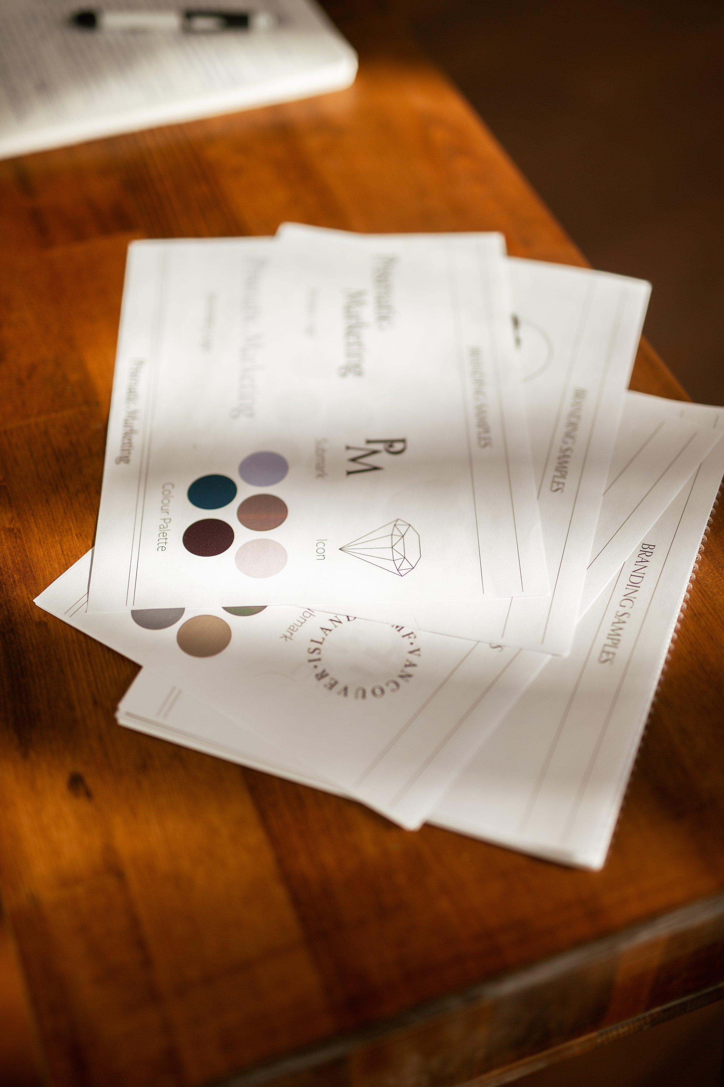
Submarks
These are playful elements that are derived from your primary logo. Oftentimes, submarks will feature your business name initials or a very simplified version of your name. They may also include a custom branded icon in addition. These submark elements should never replace your primary logo or any logo variations. Instead, they should be used to complement your logo designs. Some applications of submarks include using them as playful elements on your website, in your packaging design (maybe in a pattern?!), on the backside of your business card, or on social media graphics.
Icons
These fun supportive elements help solidify that brand recognition. Icons can be found within primary logos and/or variations, or they can be additional pieces of brand visuals that relate to what your brand is all about. For example, if you own a nature-based brand, perhaps you have an illustrated tree as a brand icon that is featured in your primary logo. You can use these icons on social media, as accents on your website or on any customer touchpoint that you want to add a bit more brand personality to.
Favicons
You know that little tiny icon on the left side of the browser tab? That’s a favicon. I like to create these for clients who have websites to add that extra touch of brand recognition through a cohesive identity on every customer touchpoint. You can most certainly use a submark or an icon in this space, but sometimes it works to create a custom favicon that elevates the brand that much more.
Patterns
Patterns usually consist of a combination of brand elements. I love designing patterns that feature submarks and icons. Sometimes throwing in your primary logo amongst icon elements can also be a unique perspective on patterns. Patterns are typically used for product-based business packaging, such as tissue paper or boxes, but can also be used on websites, backs of business cards or other print collateral.
Colour Palette
I love colour theory, so developing colour palettes that speak to your core values and your ideal customers are most definitely my jam. When I develop a colour palette for my clients, I deep dive into their values and how they want their business to be perceived. From there, I choose 2-3 main colours, as well as 1-2 secondary colours that support the primary colours. Colours help with storytelling, they help spark emotion and feelings and they build a memorable brand.

Font System
Font Systems, also known as Typography, create consistency throughout all customer touchpoints. If you had multiple fonts that didn’t match, would your brand stand out and be memorable in your audience's minds? Maybe it would, but for the wrong reasons. A typical font system usually consists of 2 or 3 fonts. It can also include custom lettering. These font systems generally will include notes on what to use for your headings, your body, and any accent text such as buttons or if you want information to stand out.
Brand Collateral
These are the tangible aspects of your brand. Think everything that you may use to display your brand. Brand collateral can be a variety of different things, from digital to print materials. Some common print collateral items include business cards, packaging design (hang tags, shipping supplies like mailers or boxes, tissue paper, etc), flyers, or brochures. Some common digital collateral items include social media templates, infographics, website design, and email marketing campaigns.
The world is basically your oyster when it comes to brand collateral, so ensuring those touchpoints match your overall brand identity is important!
Brand Style Guidelines

The Brand Style Guidelines are important usage guides for your new brand identity. Your guidelines are recommendations from your designer on how you should plan to use your new brand materials. They also provide helpful tips on ways to avoid misusing your brand identity, for instance if you choose imagery that doesn’t suit your overall brand identity or if you want to place a version of your logo on a colour that doesn’t allow for legibility. These guidelines help provide direction when it comes to using your beautiful new branding.
So, to wrap it all up, your brand isn’t just a logo. Your brand is a group of elements that take your essence and strategy and roll it into a visual masterpiece. Creating a memorable brand doesn’t come from just a logo. It comes from all the pieces that go into creating your special sauce. It comes from your brand identity.
Now what are you waiting for? Let’s build your brand!